Intro Logo Competition |
| In November 2001 last year, ExoticA held a competition to see who could come up with the best logo for the
Intro Page at ExoticA. All entries were judged by XtC, the main ExoticA graphics artist. This page shows the result of the competition, and all the entries. Many of the logos here will be used on the front page of ExoticA during 2002, and the artist behind the winning logo (Chief) has won a custom ExoticA t-shirt signed by Jeff Minter, Jason Page and Richard Joseph.
Click on the images for the full size versions. |
 |
1st Place - Chief

|
|
The winning entry with a great logo using a perfect scene style, good design and well rendered. A shame it's not automatically associated with the Amiga.
|
| Amiga Relevance: 0/10 |
 |
| Scene Relevance: 10/10 |
 |
| Design: 10/10 |
 |
| Originality: 9/10 |
 |
| Overall: 7.25 |
 |
|
 |
Joint 2nd - Mark Janssen

|
|
An interestingly designed logo with a minimalistic tube-like font. The additional use of a butterfly conjures images of the MSN logo, though this hasn't biased the result! ;-)
|
| Amiga Relevance: 7/10 |
 |
| Scene Relevance: 0/10 |
 |
| Design: 7/10 |
 |
| Originality: 5/10 |
 |
| Overall: 4.75 |
 |
|
 |
Joint 2nd - TsunAmi

|
|
A very creative and almost abstract logo, with clever use of image manipulation tools. Though not particularly relevant to the scene, it has it's own strengths.
|
| Amiga Relevance: 5/10 |
 |
| Scene Relevance: 0/10 |
 |
| Design: 7/10 |
 |
| Originality: 7/10 |
 |
| Overall: 4.75 |
 |
|
 |
Joint 3rd - Clary

|
|
A visually pleasing logo that uses a pre-existing font, and with good use of the Candy Factory package. No relevance to either the scene or Amiga though.
|
| Amiga Relevance: 0/10 |
 |
| Scene Relevance: 0/10 |
 |
| Design: 8/10 |
 |
| Originality: 9/10 |
 |
| Overall: 4.25 |
 |
|
 |
Joint 3rd - Hei-di

|
|
This is the only image were the entrant has put themselves into the picture, literally! A fun logo, but with no real relevance to the Amiga or the scene.
|
| Amiga Relevance: 0/10 |
 |
| Scene Relevance: 0/10 |
 |
| Design: 7/10 |
 |
| Originality: 10/10 |
 |
| Overall: 4.25 |
 |
|
 |
Runners up - Skope

|
|
The only oldskool logo entered for this competition. A nice, simple design that harks back to the Amiga/Atari ST days.
|
| Amiga Relevance: 2/10 |
 |
| Scene Relevance: 5/10 |
 |
| Design: 4/10 |
 |
| Originality: 4/10 |
 |
| Overall: 3.75 |
 |
|
 |
Runners up - Skywalker

|
|
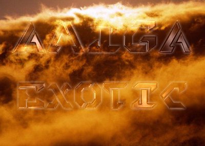
Another entry that appears to make use of the Candy Factory package. Nice choice of background image, but little relavance to ExoticA or the scence.
|
| Amiga Relevance: 2/10 |
 |
| Scene Relevance: 0/10 |
 |
| Design: 6/10 |
 |
| Originality: 5/10 |
 |
| Overall: 3.25 |
 |
|
 |
Erm.... - Syd

|
|
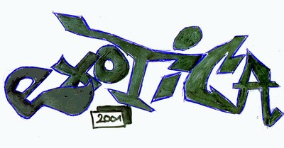
This entry is the only hand-drawn and scanned logo. Amusingly awful! ;-)
|
| Amiga Relevance: 0/10 |
 |
| Scene Relevance: 0/10 |
 |
| Design: 2/10 |
 |
| Originality: 5/10 |
 |
| Overall: 1.75 |
 |
|
 |
Oh Dear.. - Nickerne

|
|
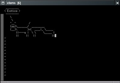
An amusing irrelevant logo, in every respect. How it found it's way into the competition, only BuZz and alcohol can truly answer. This is the only ASCII entry, fortunately! ;-)
|
| Amiga Relevance: 0/10 |
 |
| Scene Relevance: 2/10 |
 |
| Design: 1/10 |
 |
| Originality: 1/10 |
 |
| Overall: 1 |
 |
|
 |


